4 elements your nonprofit needs for better visual digital communications [case study]


 PRINT
PRINTDigital communications now means visual communications. Our brains reportedly process visuals 60,000 times more quickly than text – which is probably why the most effective and popular online communications platforms these days are highly visual. There is a strong need for almost any organization to have a polished presence on various digital platforms, and to create fresh graphics with some frequency.
Let’s assume you already have an established visual identity and accompanying brand guide* in place for your organization – with logo, fonts, colors and other supporting elements – created by a professional designer. But that you yourself are not a professional designer. Maybe you or someone on your staff are using tools to help create online, on-brand graphics (like Pablo by Buffer, or Canva and PicMonkey, described in this post on graphic creation tools), but there still seems to be a missing link between the information in the brand guide and the elements you find yourself needing online.
*If your organization does not already have one, read why an established visual identity and brand guide is a critical part of every nonprofit’s communications toolkit; and here’s a case study on how branding helped a meditation organization communicate more clearly and effectively.
If you have the following four items ready to go in your toolkit, rolling out graphics for your website, blog, email and social networks will be much easier and the result will be more consistent and polished. For a practical example, don’t miss the case study below!
Have a professional design these four elements for your nonprofit
It might help to have a professional designer’s assistance to get you started with templates and individual graphic elements which you can use as a starting point for customization, depending on each application.
1. Individual graphic elements
These are custom graphic files in multiple handy, ready-to-use formats available to apply in various situations, such as infographics, Facebook ads, web banners, email and many other uses. Depending on how comprehensive your brand guide is, these might be included in the package – but they might not.
For example, Queens Botanical Garden (QBG) in Queens, New York chose botanical illustrations as individual graphic elements to represent their unique institutional brand. These basic black and white designs can be applied across a spectrum of media, using a range of scale and color:

image credit: Queens Botanical Garden Graphic Standards Manual
They’ve adapted the dahlia flower graphic (above, bottom left) and placed it on this web page to add visual interest.

2. Background
A simple, large background with textures, colors, applied filters, etc. that can be sized as needed. Useful for your Twitter profile or PowerPoint slides, for example.
QBG used one of their basic black and white floral designs (above) to create this repeating purple dahlia pattern (below) – perfect as a background image that, when lightened or toned back, won’t compete with text or other imagery laid over it.

3. Cover photo
A sharp cover image for your organization’s primary social networks that fits your personality and positioning. For example, New York Insight Meditation Center’s Facebook page cover photo features a calm-inducing shot of their urban interior space:

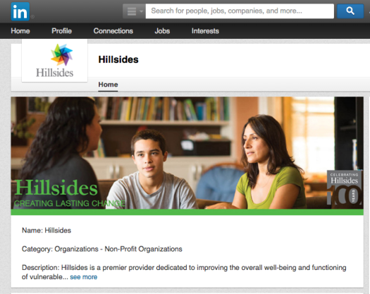
… while Philanthropy Ohio’s LinkedIn cover photo is a dynamic group shot of their people:

4. Blog post feature images
In WordPress and other web platforms, a blog post can be accompanied by a feature image – commonly a photo overlay. Since the size is set at specific pixel dimensions, creating a template is a time-saving choice for quick branded images. They can also be re-purposed – for example, for sharing pins on Pinterest.
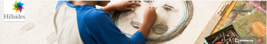
Case Study: Hillsides
Hillsides is a California-based foster-care charity that helps at-risk children, youth and families heal from traumatic experiences. There are many of these visual elements in their online communications.
The Hillsides blog features a variety of images that combine text and photography – some stock, some custom.


Marisol Barrios, Director of Communications and Marketing at Hillsides is responsible for creating some of their online content and collaborates with the in-house graphic designer on other campaigns. She describes her process for creating the blog’s visual elements:
“I use photos that we have taken from our program or choose a photo from iStockPhoto that depicts the headline or quote… I started creating the blog post images by using a template so all I need to do is replace the photo, headline or quote. I have the same for the email marketing triple content blocks.”
Hillsides also has a presence on several social media sites such as LinkedIn, Twitter, YouTube and Facebook, where they’ve chosen to feature photography of real people involved in their programs, infusing a sense of warmth and authenticity into their communications. Representing diversity is a priority since they serve predominantly Hispanic and African-American children, youth, and families. Marisol says these images are carefully chosen with the intent to re-purpose them in mind: “I have been generating branded images so that we can multipurpose the content. Once we post on the blog, we tweet it with a picture if it is advocacy or issue-based content, then we will publish on Facebook. Each social media content is generated specific to the audience and platform.” She follows her organization’s brand guidelines for uniformity and consistency.

…
If you find yourself needing to create similar images over and over again, having these easy-to-use visual elements in your “back pocket” will ensure consistency and save you time.
With online communications, what do you find helpful to have “ready to go”? Are there other graphic elements you like to have in your toolkit? Let us know!

Julia Reich
Latest posts by Julia Reich (see all)
- How to plan your nonprofit’s next annual report - June 30, 2016
- 9 steps to defining your nonprofit’s Brand Personality - November 19, 2015
- 4 elements your nonprofit needs for better visual digital communications [case study] - April 9, 2015