Ten important considerations for your new nonprofit logo

 PRINT
PRINTLet’s say your nonprofit is going through a rebranding, and it’s time to review logo options from your designer or design firm. The ensuing discussion can easily become derailed and devolve into a subjective discussion of who likes blue and who hates orange. It’s important to move beyond personal judgements to ensure you end up with a logo that serves your organization well, fits with your brand and can be used easily in your marketing materials.
I’ve developed the following checklist, which helps guide the discussion for our clients as they review and evaluate their design options. And while some decisions will always be of the “gut” variety, specific and established design criteria – along with solid strategy – can be used to evaluate whether a new nonprofit logo is “good” or “bad”:
1. Simple
Is your logo aesthetically sound, with no extraneous elements?
This re-design illustrates the difference between an overly busy logo and the beauty of a simple logo (of course, they changed their name, too, which helped a lot). The old concept of a tablecloth with the U.S. flag pattern was a smart one, but the execution was fussy with too many words crammed together.
Source: underconsideration.com/brandnew
2. Memorable
Will your logo stick in people’s minds? Does it involve the viewer in some way?
This logo, from the Committee of Organ Donation in Lebanon, is clever and unforgettable.
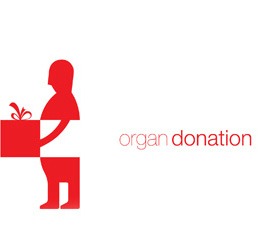
Source: underconsideration.com/brandnew/
3. Perfectly Executed
Is the logo crisp, clear, easy to read and understand?
This logo is a wonderful design which could fit into any category on this checklist. The beautifully rendered imagery of the nurturing adult and baby whale curled up together is “quintessentially Northwest, inspired by regional artwork”.

Source: underconsideration.com/brandnew/
4. Meaningful
Does your logo give a sense of what you do or convey the impact you have? Does it support your organization’s goals and objectives?
At the outset of this logo re-design project, our client at New York Insight Meditation Center told us, “We know it is time to re-brand because we realize that our old logo of the circular hands and tagline A peaceful refuge in the heart of the city do not resonate for us anymore as a full expression of what we have become—a diverse community dedicated to transformation.”
About the new mark we designed for the Center, our client concluded, “Our new logo which blends the vibrancy of the city with the beauty and grace of the lotus flower… and the tagline Where hearts & minds awaken both reflect a much more profound and holistic message about us now.”
![]()
Source: Stone Soup Creative
5. Unique
Does your logo distinguish you from other organizations? Does it have a unique look? Does it avoid obvious visual clichés?
In this example for a project we did a while back for an urban neighborhood organization, we began by examining the “competitive” landscape of similar groups. Because the organization expressed a strong “multi-ethnic” identity, we started there – and discovered many, many logos using colorful human hands – hand holding, overlapping hands, hands in circles. While many of these were beautiful logos, we decided to avoid this cliché and emphasize our client’s unique qualities by exploring alternative design solutions.

Source: Stone Soup Creative
6. Impactful
Does your logo convey a sense of hope or other positive emotion? Does it stand out and catch your eye?
Look closely – on either side of the black tree, the faces of a gorilla and lion appear in white. This clever use of negative space reveals secondary imagery which catches the viewer’s eye.
Source: images.google.com
7. Authentic
Does your logo match the tone of your organization? Is it appropriate to your audience and sector? Does it feel genuine and appropriate for what you do, who you do it for and who you want to reach?
This logo works so well because it is evocative of the gray, staggered skyline of New York City. While it would never be appropriate for say, a social service agency, it feels just right for an urban dance company.

Source: images.google.com
8. Sophisticated
Does your logo convey a sense of professionalism?
Even a logo for an international charity that helps children with cleft palates can appear modern and professional.
Source: images.google.com
9. Fresh
Does your logo look current and not dated? Does it have enduring value? Does it avoid trends? Will it stand the test of time, and look just as fresh in several years as it does now?
Logo designs can fall into trendy traps. Did you know that hand-lettered type and flat, faceted, non-digital-looking logo designs are all the rage right now?
10. Flexible
Will the logo reproduce well in small sizes and on a computer screen, not to mention a variety of other media including a business card, tote bag, social media outlets, email newsletter…? Does it look just as good in one color or black and white as it does in full color? Does it lend itself to motion? Do you need a tagline or other descriptive text to go with it and if so, will it accommodate one?
Here’s an example of a logo re-design we completed a few years ago for GrowNYC – the group that brings the famous Union Square Greenmarket to NYC, as well as a whole host of other innovative, environmental programs and initiatives – and a host of applications, large and small (including a carved pumpkin!).
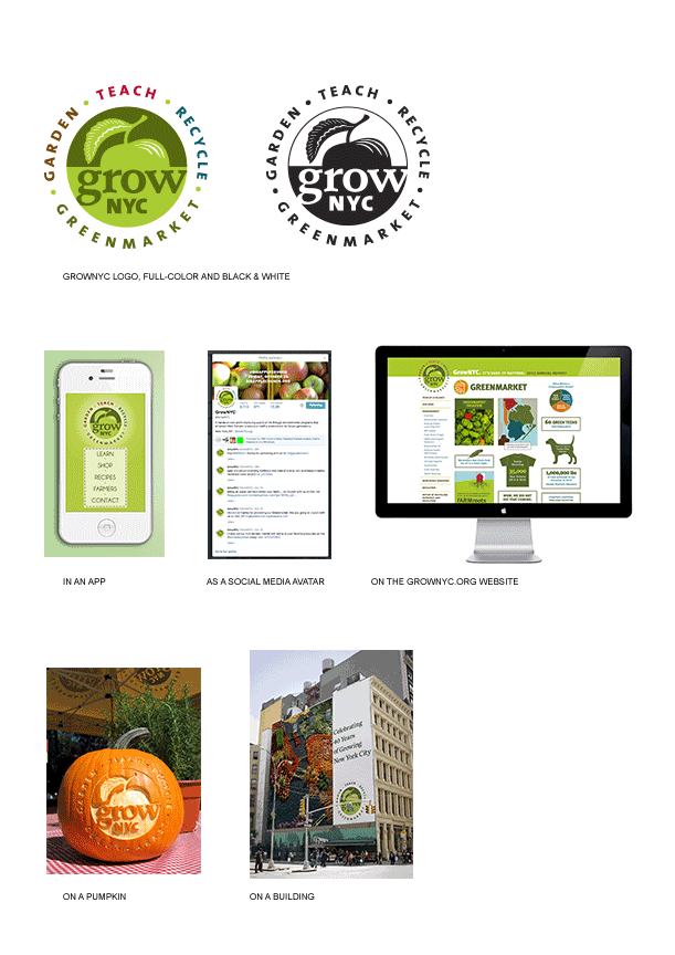
Source: stonesoupcreative.com
Not every logo design is going to hit every key marker. The first three are most critical. Get those three right and you’ll be well on your way to logo righteousness.
And of course, this worksheet isn’t just for new logo designs. Feel free to use this checklist to assess your current logo if you’re considering a redesign.
…
Here are a few more key pointers on how to be prepared at a logo presentation:
- Bring an open mind and an enthusiasm for change.
- Your opinions on the logos as they relate to your organization’s goals are paramount – not necessarily just your personal preferences.
- Be prepared to narrow down your selection in an efficient manner and give clear, articulate feedback on what logo you’d like to move forward with and what, if any, changes you may have.
Finally, a friendly reminder that the logo is not the only element of your brand identity. It is a part of the whole picture, but not the whole picture. You will be utilizing the logo within an entire brand identity system, along with other elements such as color, typography, photography, video, text, a tagline and other content that help to complete your unique story. In other words, while it is extremely important, the logo does not have to communicate every single thing you stand for.

Julia Reich
Latest posts by Julia Reich (see all)
- How to plan your nonprofit’s next annual report - June 30, 2016
- 9 steps to defining your nonprofit’s Brand Personality - November 19, 2015
- 4 elements your nonprofit needs for better visual digital communications [case study] - April 9, 2015