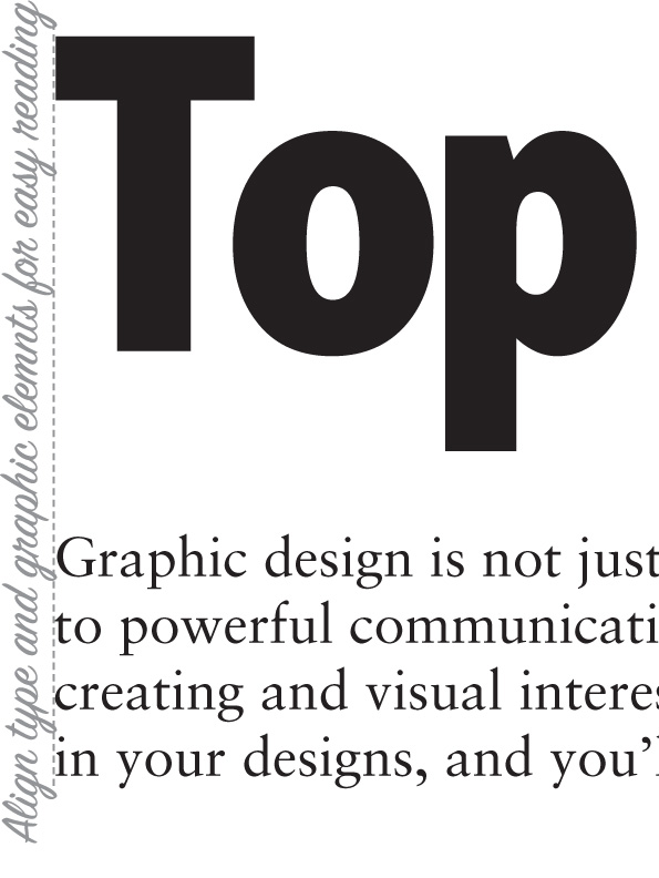
Top 5 design tips for non-designers

 PRINT
PRINTAs a communications professional working in a nonprofit setting with a minimal budget, you’re always having to be creative and resourceful in how you spend. If your budget for a communications project won’t stretch to accommodate a graphic designer, you can still produce an arresting piece. Graphic design guides the reader through your communications by creating and visual interest and flow. The placement, sizing and alignment of type and images across the page plays a vital role in how your audience perceives your message.
As I started to think about the best way to remember the following tips to produce a good design, an acronym and an idea began to take shape. Acronyms are generally discouraged in non-profit messaging, but in this case, it should help. The acronym is unusual and memorable — CRAWL. The idea behind the acronym is that famous phrase “you have to crawl before you can walk”, or in this case, master the basic principles of good design before you’re ready for the next step.
And now on to what CRAWL stands for:
C – Contrast
Contrast is a great way to create visual interest. Simply by making some elements, like headlines or photos, a larger size than other elements like body copy, you’ve got contrast. Think of how your eye is drawn to a big headline in a newspaper. Used to its best advantage, contrast immediately commands the attention of your reader to the element you want them to concentrate on first.
Contrast also comes through the judicious use of colour. Highlight areas in your design using a contrasting colour to the main design to achieve this. Keep in mind that your background (often white or a light colour) in a design requires contrast to make a design comfortable to read. For example, yellow copy doesn’t have enough contrast with a white page, so use a colour with a deeper hue.
Remember, contrast is only contrasting if elements are different enough from each other to stand out. If you make everything large, it will defeat your intentions.

R – Repetition
Another key element of a good design is repetition. Repetitive graphic or type styles in a design improve flow and readability. If there are too many different elements, it becomes distracting.
Generally in a text piece you need a maximum of two typefaces – a headline and subhead type and a body copy type. If you use particular treatment on photographs, like a thin black outline, use that same treatment throughout. In combination with contrast, repetition enables the design to come together in a cohesive whole.

A – Alignment
Alignment is your ally to guide your reader’s eye through your design in an orderly way, and to enhance your communications piece. Often we think of alignment only as it relates to copy. We’re all familiar with the alignment functions for type in word processing programs. As English and other western languages read from left to right, the most common layout for type is left-aligned.
If we take this principle to the next stage, alignment of other graphic elements, such as aligning the straight edge of a photograph to other selected type elements or even other photography, will increase the readability of your piece. Use the guides and grids in your program to help you with this principle.
W – White space
It’s fair to say that good use of white space is a design mantra. White space refers to the areas of a design that do not contain any type or design elements. It may be tempting to fill up every space in a communications piece simply out of a feeling of economy. Isn’t it a missed opportunity not to use all of the real estate on a page?
In fact, poor use of the white space available can undermine your message. The design becomes dense and difficult to navigate for your reader. Strategically, leaving some areas white where it makes sense in the flow of information, helps guide the eye through the design, and creates lightness in your piece. At its most simple, think of the space you leave between paragraphs. Instinctively, we all know that creating a continuous flow of copy with no visual breaks becomes taxing for the reader. Apply that idea in a more conscious way to your design and it will immediately become more appealing.

L – Look and Feel
As a final tip, the L in CRAWL refers to Look and Feel, otherwise known as visual identity or graphic standards. If you work in a non-profit that has a strong brand, graphic guidelines may already be in place. Make sure you study these in advance of starting your design. Instead of starting with a blank page, graphic standards offer specifications on fonts, colours, graphic elements and photography, and proper use of logos. Consistency in design is one of the cornerstones of a great brand, and by making effective use of guidelines you are reinforcing your organization’s core messages.
Graphic design is not just a way to ‘make things pretty’. In fact, good design is integral to powerful communications. Make use of these principles on an ongoing basis in your designs, and you’ll soon be crawling with ease.
This content is also available as a handy Top 5 design tips for non-designers tip sheet.

Katherine Moffat
Latest posts by Katherine Moffat (see all)
- 7 ways to get the most out of stock images when you can’t afford to hire a pro - February 4, 2016
- How to design a logo that actually works for your nonprofit - June 18, 2015
- How to manage a pro-bono agency relationship - October 23, 2014