7 ways to get the most out of stock images when you can’t afford to hire a pro

 PRINT
PRINTSometimes, starting a new marketing project from scratch can feel like working with a new recipe. To make it great, you’re looking for the right proportions of quality raw ingredients to create a memorable and lasting impression. One of those key ingredients is likely to be imagery.
The reality is that while it’s not always financially possible to hire a professional to produce custom images and you may not want to ask for yet another donation of services, you can make a high quality substitution by using less expensive stock imagery available from a large number of online providers.
By applying these 7 practices, you can get the most out of this crucial raw ingredient.
1. Search with purpose and patience
 One clear disadvantage of stock images is that the rest of the world has access to the same pool, but all of these suppliers feature ever-expanding catalogues of material. Before you start wading through the daunting number of images available, do some brainstorming with your actual copy in hand, so you can approach the search with a clear idea of what you need.
For the purposes of this post, I’ll refer to a few of the big suppliers of stock like istockphoto.com, dreamstime.com, shutterstock.com and veer.com.
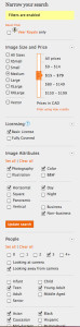
All of these suppliers have sophisticated search engines, but it still requires you to get specific and savvy with the filters already provided. Be patient in your search as not all search engines or criteria are equally easy to use across all sites.
In this example, I’ve decided I need some colour images of 3 young people with diverse backgrounds in a casual environment for a brochure. By getting specific with filters, I can narrow down a pool of more than 670,000 images to a few hundred in less than a minute. If I then add a term like “indoors” or “outside” to the main search criteria, I can get even closer to what I’m looking for.
2. Stick with one photographer
Though many stock imagery sites started out as a marketplace for a whole raft of creators looking to make a profit from their output, these sites have become magnets for professionals as well. So, you can access high quality images from a pro photographer for a fraction of the cost of hiring one specifically for your piece. If you like the look of a particular shot, take some time to explore that photographer’s other work. You may find a whole portfolio full of great images with similar lighting and style for your project.

In this example, I was attracted by the stark, contrasty lighting and mood of these stylistically similar portraits by jmpaget on Veer. They worked seamlessly to strengthen an article on depression that I art directed.
3. Go towards the light!
Another way to get the most out of your stock images is to choose a group that have a similar lighting style. This gives your piece a more cohesive feel and creates a professional impression.
For example:
- Choose images that use natural lighting throughout to create an approachable tone
- Choose photos with balanced studio lighting to impart a more corporate aura
- Images with a strong lighting contrast can add to an overall mood (see above) in your piece.
Any of these choices could be appropriate depending on your messaging.
4. Themes aren’t just for copy
As a communicator, you’re aware that weaving themes through your writing can create flow and rhythm. Apply this principle visually and themes become really helpful in finding great stock photos. A simple way to use this selection method is to choose images that directly relate to the themes in the copy.
Another approach is to choose visuals that reflect themes metaphorically and that are complementary to the copy to create a richer, more lasting impression with your audience. Avoid tenuous visual links though because, to be effective, your audience will need to grasp the connection as they read.
For example, you might have a story in a newsletter about teamwork. Instead of taking a direct approach and including a shot of a group of people, you could search for less conventional images such as of a group of geese flying south in an organized pattern, or even a well-oiled machine in a factory with all parts working well together. Both of these convey the theme of the team in memorable and unexpected ways.
5. Treat your images with care
Some stock photography images certainly live up to their reputation as trite and boring, but that’s no reason to write off stock photographs entirely. However, since we’re living in the age of image ubiquity, it’s crucial to search out the gems in the enormous glut that’s out there.
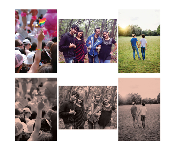
Once you’ve narrowed down a set of strong imagery, remember that you don’t always have to use them as is. You can bring a fresh perspective by creating a unified visual style to be applied to all the visuals in the piece. For example, if you’ve collected a set of disparate colour images, you could transform them to black and white. If you don’t have Photoshop ®, a free tool like PicMonkey may be useful to help with this.
You could also apply a colour from your brand standards to tie them together as demonstrated in this example below using images found on iStock. These techniques can transform a set of images from elements that merely illustrate into a design statement.
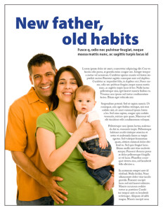
Finally, think about framing images beyond the square and the rectangle. Though photographs taken with a white studio background are sometimes criticized as dead giveaways for stock images, they are usually very well lit. Instead of worrying about this style being too “stocky”, use the close-cropped nature of these photos to your advantage. You can create interest in the design and avoid the predictable choice of straight edges with copy. Try running your copy around the shape as in this example.
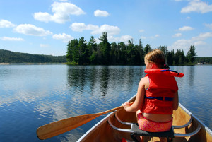
6. Compose yourself
Composition is another key to choosing the best images for your piece. The Rule of Thirds is a handy reminder here. In a landscape photograph for example, there is more visual interest in a picture that’s approximately 2/3 land and 1/3 sky, or the reverse. An image with the horizon right in the middle is less interesting.
The same could be said of an image with people. An image with the subject in the dead centre is not necessarily your best choice. A shot like the one below is more intriguing to the viewer, who can get a sense of scale, and wonder what the subject is observing in a moment. Also, remember that if you find a great shot with a staid composition you always have the option to crop.
7. Choose not to default
These days, with the overwhelming ubiquity of photography, it’s easy to simply default in that direction when choosing imagery. However, many stock sites also offer large banks of illustrated imagery. Perhaps it’s time to go a different way with your next project and choose a set of illustrations instead. The only limits on here are your own imagination and your brand. You could even consider combining photography and illustration in the same piece.
While you may not be able to swing a day rate for a photographer, or purchase a custom illustration, you can still make your recipe for a powerful marketing piece work with worthy substitutions from stock sites. Happy hunting!
7 ways to get the most out of stock images when you can’t afford to hire a pro #NPMC Share on X
Katherine Moffat
Latest posts by Katherine Moffat (see all)
- 7 ways to get the most out of stock images when you can’t afford to hire a pro - February 4, 2016
- How to design a logo that actually works for your nonprofit - June 18, 2015
- How to manage a pro-bono agency relationship - October 23, 2014