Colour printing vs black and white: how to make the right choice

 PRINT
PRINTIn previous posts, I discussed choosing a printer, and the differences between common printing processes. As a marketing pro in the nonprofit environment, you also need to understand some of the other subtleties and perceptions of colour printing vs black and white when giving direction to your designer.
In this post, we’ll look at some considerations, including audience and cost, when you make decisions about printing in one colour, with a spot colour or in full colour. We’ll also look at how your choices in paper and finishes have an influence on your message and your budget.
Black and white is one colour
Though it sounds like two colours, black and white printing refers to printing in black ink on white paper. Another term for this is one colour printing.
Spot colour printing
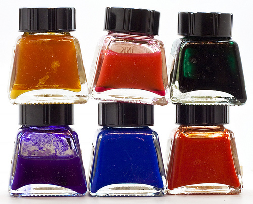
Spot colours are often used to highlight elements within an otherwise one colour design. True spot colour comes into play only on a traditional printing press, as it refers to an individual ink reservoir where that ink is placed. Most often, spot colours are inks made to industry standard recipes. The term you’ll hear is Pantone© or PMS (Pantone Matching System) in reference to spot colours.
Full colour printing
Full colour printing, or four colour process printing, produces the full range of colours using layers of four inks – cyan (C), magenta (M), yellow (Y) and black (K). It is possible to mimic all colours using just these four, even PMS colours.
What to consider when choosing your colour palette
Audiences and perceptions
One of the first things to think about is who’ll be receiving this piece. Hand in hand with that is the message you are conveying with the printed item.
The questions and examples below will help you to choose your colour palette:
Is the audience high net worth donors or corporations? Often with this group, nonprofit brands are best communicated in full colour to heighten the perception of a professional, financially viable organization.
Is your audience primarily individual donors? Make strategic use of spot colours to add some life to newsletters and brochures for a reasonable cost. Your organization may choose to supplement minimal print colour with online resources. Your choices here can underline responsible stewardship of donor dollars.
What about prospective volunteers? Creating the perception of an engaging organization is key and can often be accomplished through colour in brochures, recruiting posters or buckslips.
Special event audiences will be most engaged with a full colour treatment on major marketing pieces such as posters, ads and outdoor applications to encourage ticket sales. Be strategic with the support materials such as tickets or programs, by keeping them to one or two colours.
Finally, audiences with a personal connection to your cause will be less interested in colour selections and more motivated by important content. A one or two colour information sheet will be just as effective as full colour.
Graphic standards and design
If you have them, review your nonprofit’s graphic standards or guidelines, and think about what you need to communicate with your design before making a final decision on colour.
Do the graphic standards of your organization or a sponsor dictate the colour choice? For instance, is there a requirement to print logos, whether yours or a sponsor’s, in PMS spot colours for accuracy?
Does your design emphasize imagery as opposed to copy? This will often drive the choice of full colour over one colour.
Is your design text heavy? Could you accomplish your communications goals with one colour?
Budget
Budget is a key driver of colour choice.
One colour is certainly the least expensive option.
Adding a spot colour is a way to keep the cost down and make the piece more engaging.
Full colour process is more expensive than above, but is often the most engaging and effective way to communicate your message with your audience. Large quantity print runs will significantly diminish the cost per unit.
Consider choosing a combination of colour and black and white if your piece has more than one side, or a number of pages. For example, a full colour cover on a booklet with black printing only in the interior may be a cost effective and appealing choice for your audience.
Consider whether the piece may be reproduced in future. You may have money in your budget this year for a full colour piece, but will that same budget be available for reprints?
Timing
Consider the turnaround time for a piece.
A full colour piece will usually take longer to print as there may be proofing time involved. Design time is also affected with a full colour treatment.
Considerations in paper stocks
Don’t view your choice of paper as an afterthought as it can affect your budget and the perception of your piece. There are two main paper categories: uncoated and coated.
Uncoated paper
The easiest way to think about this stock is to look at a newspaper or the paper used in your office printer.
Uncoated paper has a rougher feel, is less bright white and absorbs ink much more readily.
This paper may more closely align with environmental messages or your organization’s values, especially if it contains a large percentage of post-consumer fibre.
Be aware that often, uncoated papers may actually be more expensive than the more ubiquitous coated papers, even though they have the opposite perception.
Coated paper
Coated papers are produced using coatings, fillers and brighteners to make them smoother, whiter and glossier. The most common finishes are matte, silk and gloss.
Ink sits on top of the coatings and appears brighter than on uncoated stocks.
Coated papers are a reliable choice for image heavy, four colour process printing.
Keep in mind that glossy finishes have become synonymous with the perception of excess even though the actual price may be reasonable. Could this impression clash with your brand? If so, choose a silk or matte finish.
It’s always a great idea to research if the paper you select has been produced using Forest Stewardship Council (FSC) guidelines.
Give yourself the time to think through and discuss these considerations with your team, your designer and your printer before moving ahead with your piece. Your choices can help your communications succeed with flying colours.

Katherine Moffat
Latest posts by Katherine Moffat (see all)
- 7 ways to get the most out of stock images when you can’t afford to hire a pro - February 4, 2016
- How to design a logo that actually works for your nonprofit - June 18, 2015
- How to manage a pro-bono agency relationship - October 23, 2014