How to create style tiles for web design in 3 easy steps

 PRINT
PRINTWouldn’t it be great if your designer or design team could reach into your brain and pull out all the things you want (and don’t want) in your organization’s website design? It can be difficult to verbalize to others what you like (and don’t like) if you haven’t been trained in a visual vocabulary.
I’m going to explain how a simple visual reference called style tiles helps communicate the essence of a visual brand for the web – without getting everyone bogged down in design specifics too soon. It establishes design criteria early on, so you can get critical buy-in from your colleagues.
What are style tiles?
Style tiles are a design deliverable that are like digital mood boards for website design projects. Similar to interior designers who use mood boards to display favorite colors, fabric swatches, etc – style tiles set parameters for elements such as:
- button styles
- navigation styles
- headlines, body copy, and other text styles
- photography and other imagery
- color palette
- textures
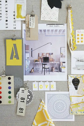
Interior designers often create a mood board collage. Credit: http://ampersanddesignstudio.com/category/mood-boards/
Style tiles are not intended to establish page layout, placement or size relationships, content, navigation, information architecture, dimensions – or any of the more literal characteristics a wireframe or page design will specify later on in the web design process.
Here’s how to create a Style Tile:
Step 1: Ask Questions
It’s important to learn as much as possible about a website’s reason for being. You, your designer, and your ED will all have different viewpoints. As part of the planning process, a detailed brief that includes creative strategies along with business objectives should be shared with the project’s most important stakeholders. It is the project manager, most likely, who will need to discover answers to the following kinds of questions:
- Goals – what is the single most important purpose of the new site, and what are the secondary goals?
- Audience profiles – what are the demographics of the site’s target users?
- Perceptions – what do you want your target audience to think and feel about your organization, in response to your new website?
- Competition – how you are different from other agencies doing similar work, and what are the factors that will make this site a success?
- Communication strategy – what are the main messages you are attempting to convey, and how will they be conveyed?
- Design preferences – are there any strong visual preferences, pro or con? What sites do you find inspiring? On the flip side, what are your pet peeves – are there things to stay away from, design-wise?
Step 2: Synthesize
Now, look through the answers to spot recurring thoughts and themes. Try to categorize them. The goal is to come up with a list of adjectives that summarize the site’s attributes and ‘personality’.
Next, consider how those adjectives can be translated into graphics, fonts, images and colors that can be used to express the website’s look and feel. This part of it is more art than science, and while you don’t necessarily need design training, it definitely helps to be a visual learner, with an awareness of some basic design principles that are affectionately known as C.R.A.P (coined by Robin Williams – no, not the actor – in her book, the Non-Designers Design Book):
- Contrast
- Repetition
- Alignment
- Proximity
… and the elements used to execute those principles:
- line
- color
- shape
- scale
- texture
- space
Step 3: Create a Style Tile
Ready to give it a go? Here’s a Style Tile template you can use.
Try to match up the list of adjectives you developed with a style for each of your website’s design elements. For example, let’s say you work at a local environmental group. Your list of adjectives might be:
- Community
- Grassroots
- Collaborative
- Active
- Inclusive
- Transformative
Your choice of colors could include shades of blue and green, since these are indicative of the outdoors, freshness, harmony, and renewal; background textures could encompass organic rather than geometric shapes, since hard lines are uncommon in nature. And the fonts you choose for headers, sub-heads and body copy might be a friendly, humanistic sans serif, as opposed to a more conventional and classic serif face.
Since every website is different, feel free to change up the template depending on your project’s parameters. For example, you might want to leave out certain graphic elements, or add new ones such as border treatments, sidebars, photo captions… or present style treatments for a variety of sections, such as a blog versus another type of content area.
Example Style Tiles
A Google Image search for style tiles yields many examples you can use for inspiration. And here are two example Style Tiles we recently created for a project of the Joan Ganz Cooney Center called gamesandlearning.org, an online resource for scientific and market research, and analysis of the growing interest of educators, developers and investors in games for learning.
The brand attributes were a list of adjectives that included:
- Authoritative
- Clean
- Current
- Professional
- Conversational
- Fun
- Credible but not too serious
- Innovative

gamesandlearning.org Style Tile 1

gamesandlearning.org Style Tile 2
We had just completed the new logo design so we already had some graphic parameters to work with – such as a grid of colorful “8-bit” pixel squares, and icons for content areas using the same 8-bit style as the logo. This ensured the newly-established brand was reinforced and translated well to the web.
The Cooney Center chose the look and feel of the first style tile. We then worked collaboratively with their editorial and development team over a period of 8 months on the front-end page designs. The result is a site that is fresh, professional, and authoritative – yet not too academic-looking.

…
Style tiles are a design deliverable that help form a common visual language between designers and clients, providing a catalyst for discussions around an organization’s preferences and goals – before the design process begins.
It’s a useful intermediary step to help shape our design thinking and ensure we are all on the same page. We especially like to use them when our clients are not certain what their preferences are in terms of design.
By following the steps outlined here, I hope you’ll either successfully be able to integrate Style Tiles into your web project, or be more informed and equipped to ask an outside designer or design firm to include them as part of the process.
Sources & Resources
- Style Tiles as a Web Design Process Tool
- Sarah Baker, Creative Director, New Organizing Institute: Basic Principles of Design
- Style Tiles: A Visual Web Design Process for Clients and the Responsive Web
- Successful Creative Briefs: Linking Business Objectives and Creative Strategies, Emily Ruth Cohen and Daniel Kelly
- Robin Williams, Non-Designers Design Book, Peachpit Press

Julia Reich
Latest posts by Julia Reich (see all)
- How to plan your nonprofit’s next annual report - June 30, 2016
- 9 steps to defining your nonprofit’s Brand Personality - November 19, 2015
- 4 elements your nonprofit needs for better visual digital communications [case study] - April 9, 2015