Five little-known email metrics to boost engagement and fundraising


 PRINT
PRINTIt’s no secret that effective use of email communications is a pillar of nonprofit engagement and fundraising strategies. But how important is it, exactly?
As it turns out, it’s pretty critical. The 2016 M+R Benchmarks study found that 29% of online revenue comes from email fundraising, yet response rates to fundraising emails are down 8% from two years ago despite nonprofits sending more fundraising emails than ever.
Does this mean email is dying? Hang on to that question for a minute and let me ask you another question: when was the last time you evaluated how your organization tracks its email fundraising performance?
It’s time to get serious about your email metrics
Tracking your email performance is a big part of your overall communications strategy, but most people are still using the same metrics they were 10 years ago. (If you need a refresher on the fundamentals, I recommend reading Econsultancy’s article on seven basic email marketing metrics you should be tracking. I’ll also outline the most important ones for you below.)
The most basic metrics you should track for each email are:
- Open rate: the percentage of your subscribers who opened your email at least once
- Click rate: the percentage of your subscribers who clicked a link in your email at least once
- Bounce rate: the percentage of subscribers who failed to receive your email for one reason or another (their email address was invalid, mailbox full, etc.)
Unless you are sending your bulk email by hand, most email services will track these basic metrics for you in one form or another. Odds are, you’re already familiar with (or have at least heard of) the terms above.
These basic metrics are a fine way of explaining what people do with your email, but to become more successful you need to understand why people take or don’t take action. You need more than the basics.
5 email metrics your #nonprofit should be tracking #NPMC #emailmarketing Click To TweetThe email metrics no one talks about
I have some good news and bad news for you.
First, the bad news: a lot of these advanced-level metrics require some effort to obtain. You’ll need to do some digging, number crunching, and a bit of digital manual labor to get these figures.
But there’s good news: these metrics will give you serious insight into your email performance and significantly boost your email engagement and fundraising if you use the data correctly. And additionally, all these metrics can be automated into a series of dashboards if you get tired of the manual process.
1) Subscriber engagement over time
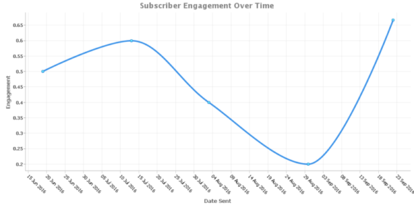 What is it?
Subscriber engagement over time measures how the engagement of a specific person (or your entire list) is changing from email to email.
This information can be extremely useful from a tactical perspective, especially when engaging with key supporters or when giving season is approaching. Knowing whether engagement is trending up or down will help you determine how aggressively you should work your list, or how you need to approach a conversation with an important individual.
How do you get the data?
First, you need to decide what engagement means to you. This can be as simple or complex as you want depending on the goals of your organization, but a great place to start is by using a click-to-open ratio.
A click-to-open ratio is the number of times someone clicked a link in your email, divided by the number of times they opened it. For example, if John Doe had 5 opens and 2 clicks in your latest email, his click-to-open ratio would be 0.4 for that campaign. The higher this number is, the more engaged a person is with your emails.
You can easily average this figure across your whole list, if you like: given any email campaign, just divide the total number of clicks by the total number of opens to get its overall click-to-open ratio.
Now that you have a formula for engagement, you can choose a handful of email campaigns over the past few months and calculate the click-to-open ratio for each one. You can do this on an individual subscriber level if you are interested in a specific person’s engagement, or list-wide if you want a broader view of how healthy your list is.
After you’ve calculated the engagement for each campaign, take the day the campaign was sent and plot your subscriber engagement over time using a line chart to visualize how engagement has changed over time.
2) Total donations per email
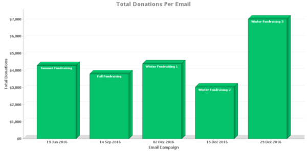 What is it?
Total donations per email is a simple figure that represents how much money you raised from a particular email. Understanding which emails are performing best from a fundraising perspective is a great way to begin spotting successful patterns you can apply to future emails. Additionally, it will help you calculate your ROI compared to other fundraising strategies so you can invest your time in the most productive areas.
How do you get the data?
The best way to start is by setting up Google Analytics to track your revenue from donations on your website. This will require a developer to create a bit of custom code for you, but in exchange you will get detailed metrics every time someone submits an online donation (not just from emails).
Once Google Analytics revenue tracking is set up, you can add some referral information to each link in your email that will associate a visit to your website to a specific email campaign. Many email services will do this automatically for you.
When someone clicks a link in one of your emails, this special referral data will tell Google Analytics which email campaign the person came from. With revenue tracking set up, Google Analytics will know which email generated a specific online donation, including the donation amount.
Some email providers like MailChimp will even pull this data out of Google Analytics for you and package it into convenient reports on an email-by-email basis.
3) Engagement by subscription length
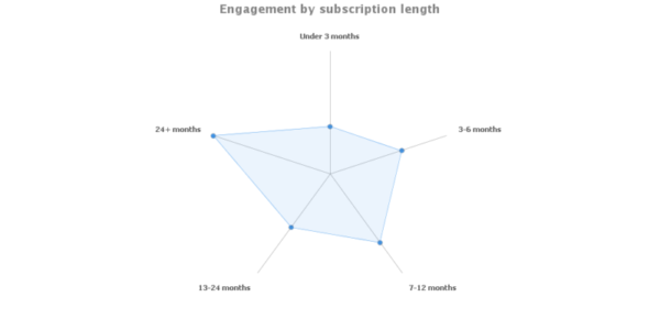 What is it?
Engagement by subscription length is a different way of visualizing subscriber engagement over time. In this case, you segment subscribers into different groups based on how long they have been on your list and compare engagement across the segments.
This method allows you to see, for example, how the engagement of subscribers who have been on your list for 2 years compares to the subscribers who have only been around 3 months. It enables you to keep an eye on the health of your long-term supporters while also evaluating how new constituents are engaging with your communications.
How do you get the data?
To begin, ensure you are capturing the date each subscriber joins your list. If not, you should begin collecting this data now as it’s useful for a number of metrics.
Next, assign each subscriber an overall engagement value (refer to #1 if you need an easy engagement formula). Ideally, a subscriber’s average engagement should take into account every email that’s been sent to them, but if you don’t have a way to do this automatically you can calculate engagement across a number of representative campaigns the person has received and average those values.
Finally, split your subscribers into groups based on how long they’ve been on your list and average the engagement values of each group. I would suggest starting with the following segments:
- Under 3 months
- 3-6 months
- 7-12 months
- 13-24 months
- 24+ months
4) Subscriber retention rate over time
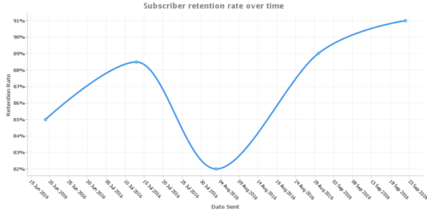 What is it?
Subscriber retention rate represents how successful you are at keeping people on your list. Every time you send out an email, you have the opportunity to lose people who unsubscribe or bounce (when their email address no longer exists). Subscriber retention rate is the percentage of people who remain after each email is sent.
This metric can be more revealing than simply tracking the growth of your list, because it’s possible to experience overall list growth while progressively losing a larger percentage of your subscribers each email. Tracking subscriber retention rate over time is a helpful way to spot these trends early so you can correct course and retain a higher percentage of subscribers.
How do you get the data?
Make sure you’re collecting the following information for each email:
- How many subscribers received the email
- How many unsubscribes the email generated
- How many bounces the email generated
Provided you have that information, you can calculate the subscriber retention rate for an email like so:
(total recipients – unsubscribes – bounces) / total recipients
For example, if you sent an email to 1,000 subscribers and 75 unsubscribed and 25 bounced, you would have a retention rate of 90%.
After calculating this percentage for each email, you can plot the data points over time to visualize how your retention rate is changing.
5) Highest performing variants (A/B testing)
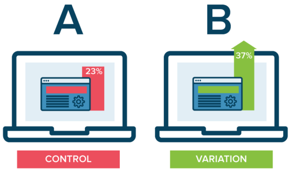
Source: Optimizely
What is it?
This metric assumes you are familiar with the basics of A/B testing.
A/B testing is an optimization strategy that allows you to test two versions of an email to determine which performs best according to your goals. You can use A/B testing to explore how changes to your email’s design, formatting, copy, or length influences metrics such as your open or click rate.
Each different version of an email you test is called a “variant.” Understanding which email variants perform the best will allow you to systematically improve your email metrics through the process of ongoing testing and refinement.
How do you get the data?
Many email providers have automated tools to help you run A/B tests. Even if your email provider doesn’t, the process of conducting a test is pretty straightforward.
Start by defining a hypothesis—an educated guess about a change you believe will bring positive improvement. For example: “I believe changing the color of my donate button from blue to red will increase the number of people who click on it.”
Next, you need to create two versions of your email: the original (this will serve as your baseline or “control” email in the experiment) and a version with your red donate button. Randomly split your list into two parts and send one email version to each segment of the list. This way, 50% of your list will receive Version A and 50% will receive Version B.
Once you’ve sent each email, compare their metrics to determine if one had significantly higher performance than the other.
Keep in mind that while one variant will always perform better, the difference may not be significant enough to prove your hypothesis correct. I would suggest using Kissmetrics’ A/B Significance Test to understand if your change was statistically significant. (You can substitute opens, clicks, or other data in place of conversions in the calculator.)
Wrapping things up
I hope this article has introduced you to a few new ways of tracking your organization’s email performance. While email is a longstanding pillar of nonprofit communications, it’s far from dead. I believe declining performance is often the result of a lack of modern evaluation methods rather than a decline in email marketing as a whole.
If you found these metrics interesting, we’ve identified an additional 7 email metrics that we couldn’t fit in this post. Make sure to check out the downloadable copy of the full 12 email metrics you can use to level up your nonprofit’s email communications.
What metrics are you using to track your organization’s email performance? Leave a comment below to join in the discussion.

Spencer Brooks
Latest posts by Spencer Brooks (see all)
- Five little-known email metrics to boost engagement and fundraising - February 28, 2017
- How to select the perfect website platform for your nonprofit - December 6, 2016